
You know that feeling when you land on a website and something just feels… off? Maybe a button looks slightly different on one page than it does on another. Maybe the spacing between sections is tight in one spot and loose somewhere else. The fonts seem right, but are they? You can’t quite put your finger on it, but something is creating a low-grade visual friction that makes the whole experience feel less trustworthy.
That is what happens when a brand does not have a design system.
What is a design system?
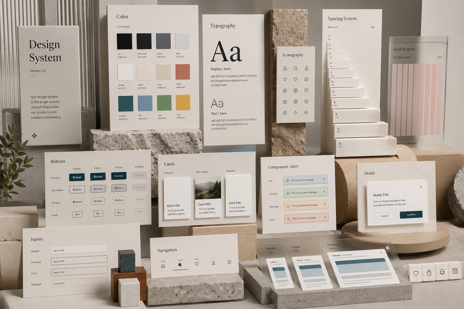
A design system is a shared set of rules, components, and standards that define how a brand looks and behaves across every screen. Think of it like a recipe book for your website or app. It includes things like:
- Colours with exact hex values so nobody eyeballs it
- Typography rules for headings, body text, and labels
- Spacing and layout tokens that keep everything aligned
- Components like buttons, cards, forms, and navigation patterns
- Guidelines for how and when to use each piece
When everyone follows the same recipe, the result is consistent. When they don’t, you get that subtle visual friction that makes users feel uneasy without knowing why.
Why design systems matter more than ever
Design systems have always been valuable. But two things have changed in the last couple of years that make them essential.
AI tools need guardrails
If you have used AI to help update a website, you have probably noticed that it does a great job following instructions, but a terrible job guessing your brand guidelines. Ask an AI to “add a new section to the homepage” and it will build something functional. But will the button padding match the rest of the site? Will it use the right shade of purple? Will the heading hierarchy follow your established pattern?
Without a design system, you spend your time going back and forth with AI tools, trying to get them to match what already exists. With a design system, you hand the AI a clear set of tokens, components, and rules. It stops guessing and starts following. The difference is huge. Instead of fiddling with CSS values and second-guessing every output, you point the AI at the system and let it work within defined boundaries.
This is not a hypothetical scenario. We built this website using AI-assisted development, and the design system is what made it possible. Every colour, every spacing value, every font weight lives in a set of CSS custom properties. When the AI needs to add a new section, it pulls from those tokens instead of inventing new values. The result is a site that stays visually consistent even as it grows.
Other designers and agencies need a shared reference
If you work with outside agencies, freelancers, or contract designers, a design system becomes your single source of truth. Instead of sending over a PDF brand guide that gets interpreted differently by everyone, you share a living system that shows exactly how components look, how they behave, and how they fit together.
This is especially important for brands that work with multiple creative partners at the same time. One agency might be building landing pages while another handles email campaigns and a third is designing an app. Without a shared design system, each team makes their own assumptions. The brand starts to feel fragmented, even if every individual piece looks fine on its own.
A good design system eliminates that problem. Everyone works from the same foundation. The brand stays consistent no matter who is doing the work.
Design systems and mobile responsiveness
Here is where design systems really earn their keep. Designing for mobile is not just about making things smaller. A button that looks great at desktop width might be too small to tap on a phone. A three-column grid needs to stack into a single column. Navigation that works with a mouse needs to work with a thumb.
Design systems solve this by defining responsive behaviour at the component level. Instead of each designer or developer deciding how a card should behave on a small screen, the design system defines it once:
- Spacing tokens scale down proportionally so layouts feel balanced at every size
- Grid rules specify exactly when columns collapse, wrap, or reorder
- Touch targets set minimum sizes for interactive elements so buttons and links are easy to tap
- Typography scales adjust heading and body sizes for readability on smaller screens
Without these rules, responsive design becomes a game of whack-a-mole. You fix the layout on one page, and it breaks on another because someone used different breakpoints or padding values. A design system brings order to that chaos. It means every page on your site adapts to mobile the same way, every time.
This consistency also saves development time. When a developer knows that every card component follows the same responsive pattern, they do not have to re-examine each one individually. They build it once, and it works everywhere.
What goes into a practical design system
You do not need to build a massive system to get started. Even a focused set of decisions makes a big difference. Here is what we typically include:
- Design tokens: Colours, fonts, spacing values, border radii, and shadows stored as variables that can be used across code and design tools
- Component library: Buttons, cards, forms, navigation, and other reusable pieces built to spec
- Layout patterns: Grid systems, container widths, and section structures that define how content is organized
- Usage guidelines: When to use which component, which colour combinations meet contrast standards, and how interactive elements should behave
- Responsive rules: How each component adapts across breakpoints, including touch-target sizes and stacking behaviour
The key is that all of this lives in one place that everyone can access. It is not a static document that gets outdated the moment someone makes a change. It is a living reference that evolves with the brand.
The bottom line
A design system is not just a nice-to-have for large companies with big budgets. It is a practical tool that makes your brand more consistent, your team more efficient, and your digital experiences better for the people who use them.
And in a world where AI tools are becoming a bigger part of how websites get built and maintained, a design system is the difference between outputs that match your brand and outputs that almost match your brand. That “almost” is what creates the visual friction your users can feel but can not name.
If your website feels inconsistent, or if every update requires more manual adjustment than it should, a design system is likely the missing piece. It is the foundation that holds everything together.